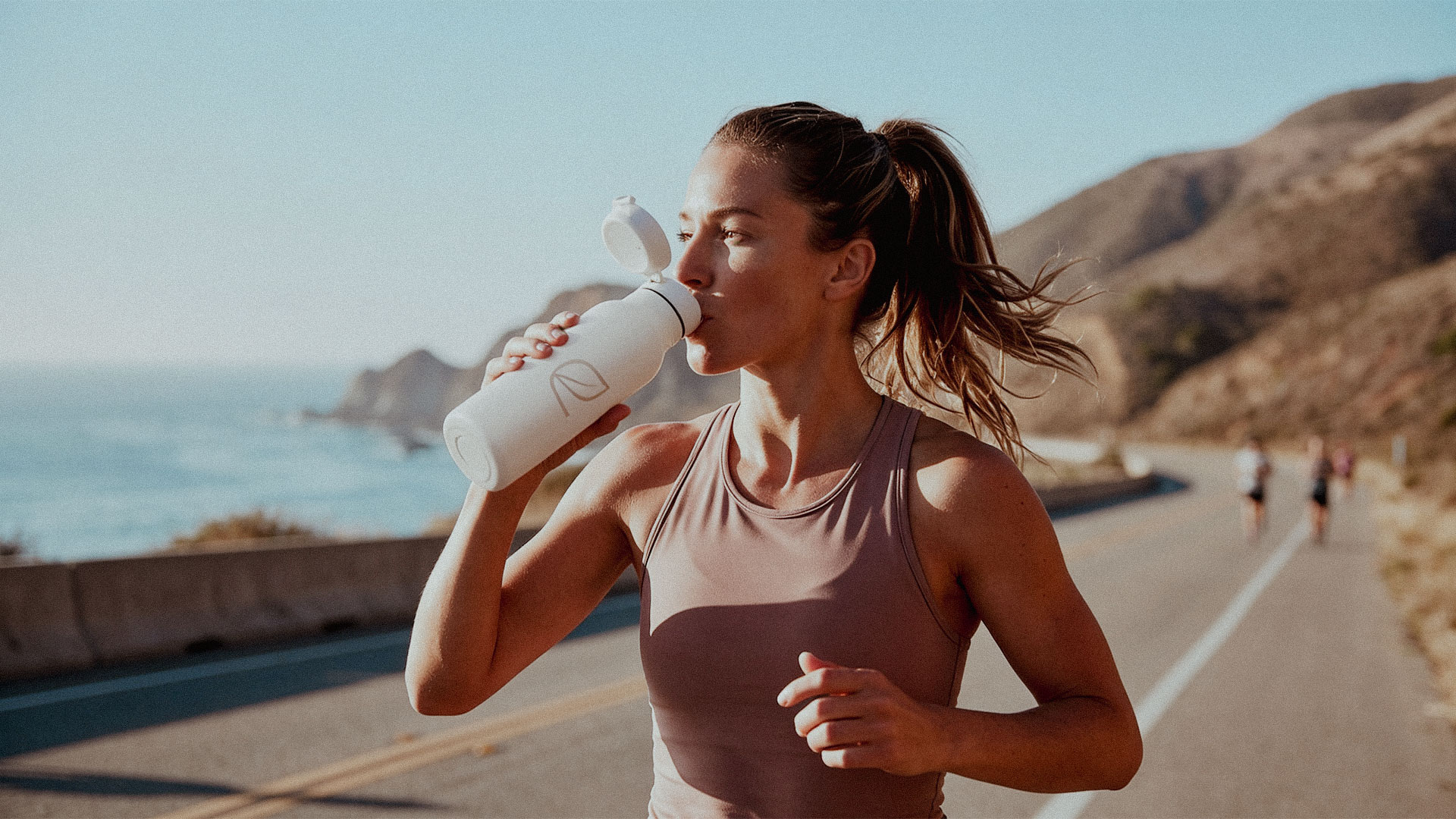
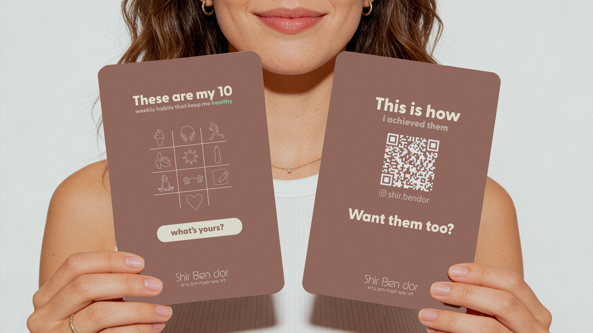
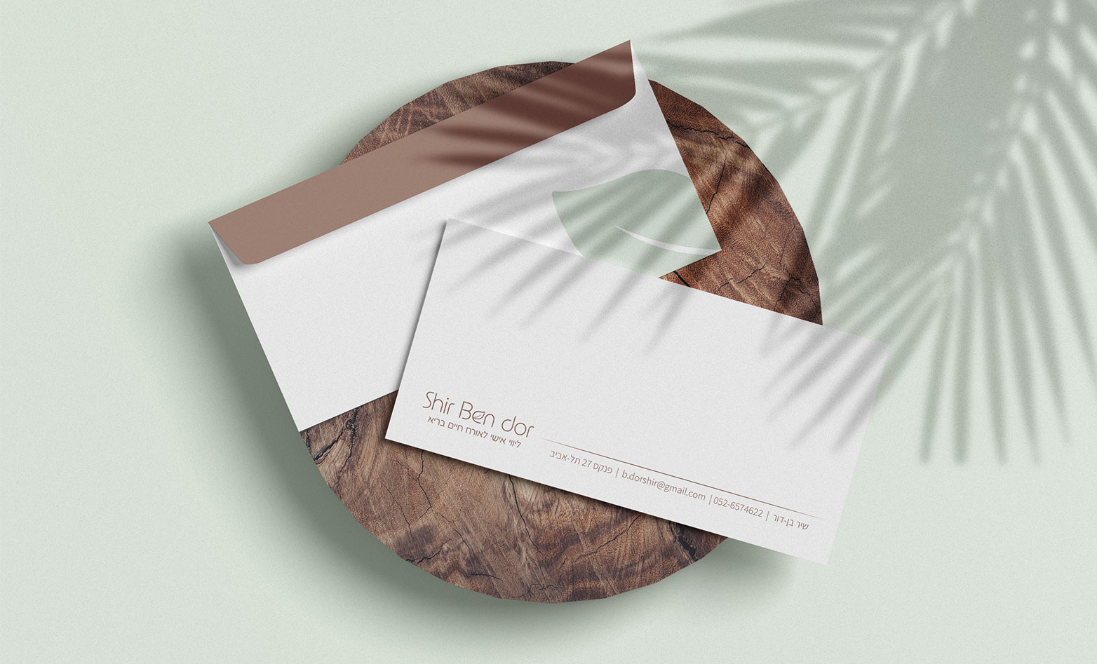
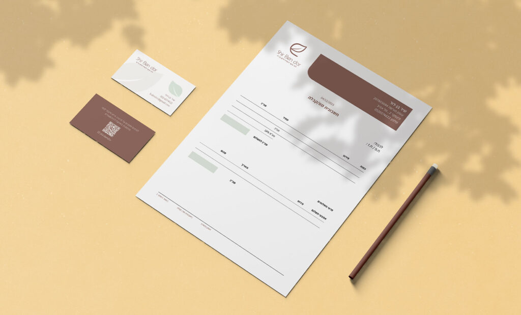
Brand identity for a nutrition and wellness coach focused on balance, consistency, and acceptance.
CLIENT
Shir Ben Dor
SERVICES
Brand identity, Art direction, Print design
BRAND AUDIENCE
Women looking for balance, consistency, and a healthier relationship with themself.
YEAR
2025
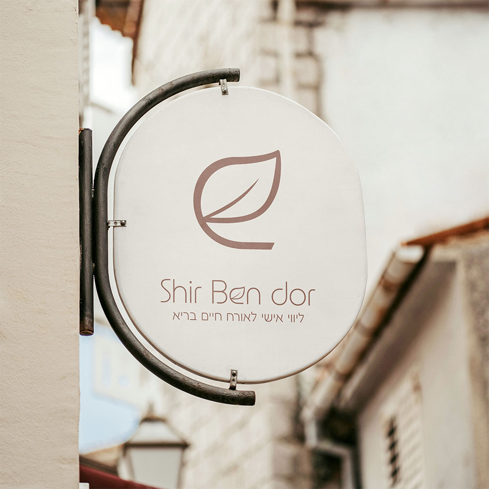
SKETCH
Finding The Symbol
I started by exploring symbols from nature,looking for a feeling of growth, healing and balance. At first, I debated between using a butterfly or keeping the symbol minimal with a clean leaf shape.
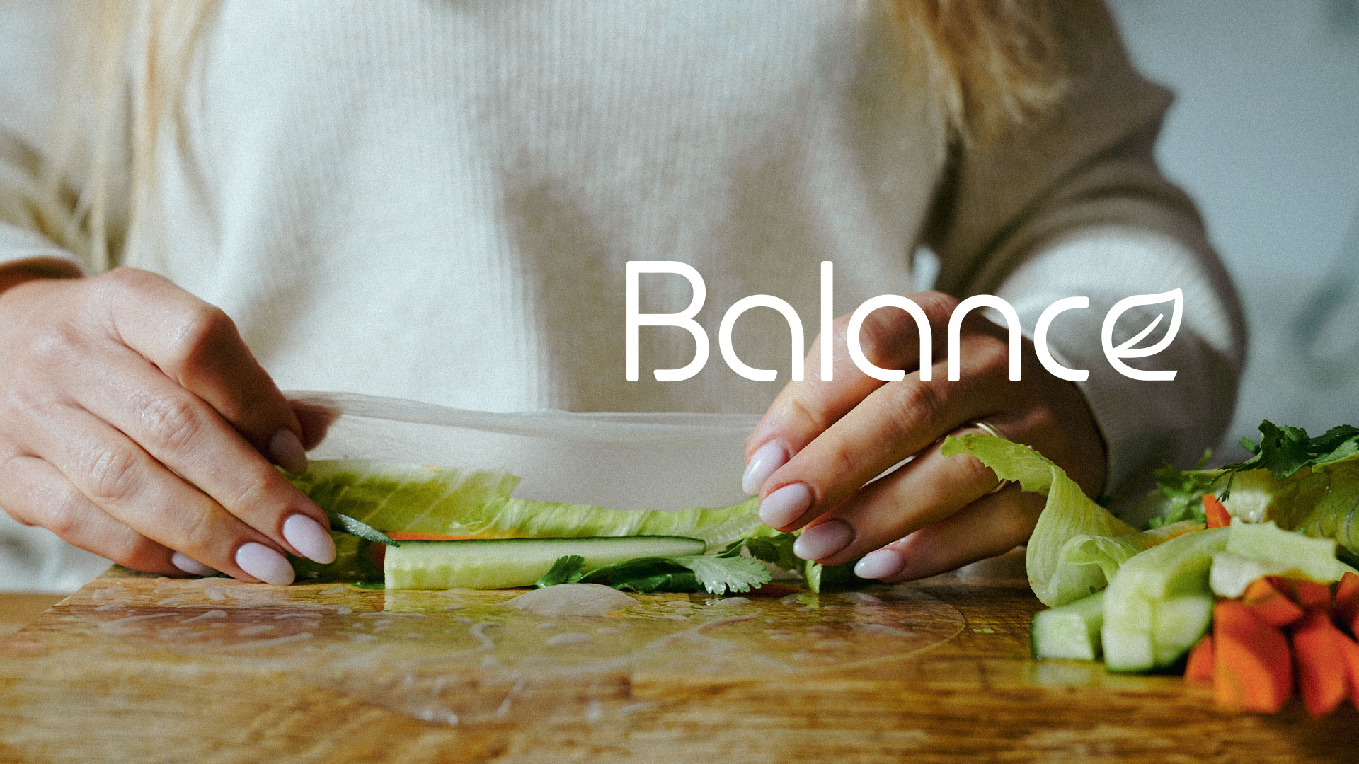
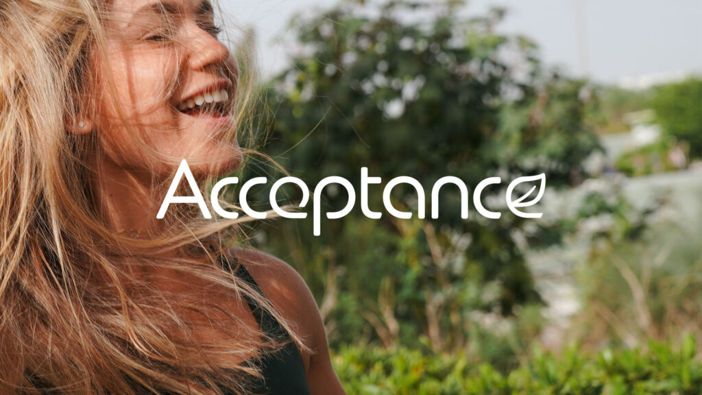
THE LOGO
The Chosen Direction
In the end, we chose the leaf for its softer, more natural and timeless feeling.
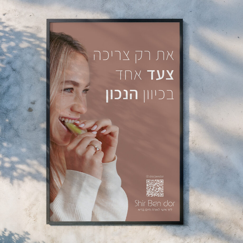
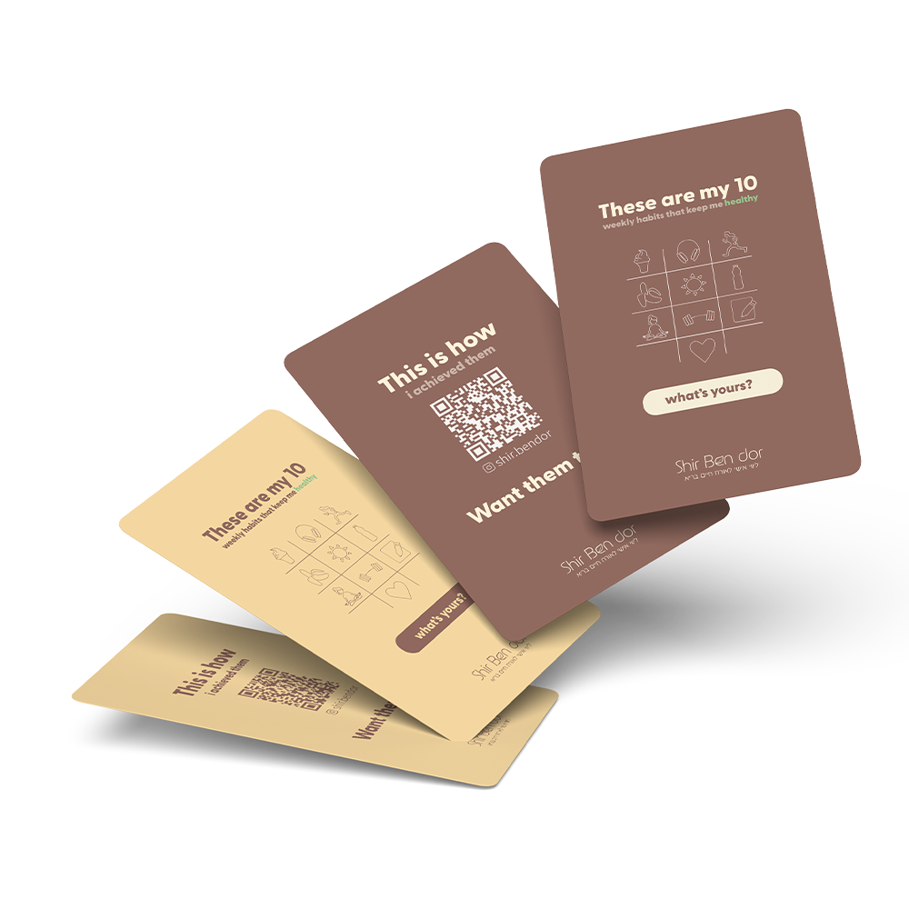
COLOR & TYPOGRAPHY
The Visual Language
How can we bring a feeling of light, growth, self-love and grounding ?