Brand identity for a lactation consultant supporting mothers from the very first feed to the end of their breastfeeding journey.
CLIENT
Maya ben-haim
SERVICES
Brand identity, Art direction, Packaging design
BRAND AUDIENCE
New and expecting mothers navigating the early stages of motherhood
YEAR
2026
SKETCH
Finding The Symbol
Started from maya’s story – inspired by her daughter, Yarden. My inspiration came from image of mother holding her child, and from there I began shaping the first visual direction.
THE LOGO
The Chosen Direction
We didn’t overthink it. Sometimes, it simply works.
COLOR & TYPOGRAPHY
The Visual Language
Built around emotional safety, feminine intuition, and warmth. Rounded organic forms, expressive typography, and warmth browns balanced with touches of blue and pink create a feeling of “baby born”
#edc1a9
#e1efe9
#f9f6f1
#a35842
#3a221a
Rubik
Carl marx
OHAgamNaim
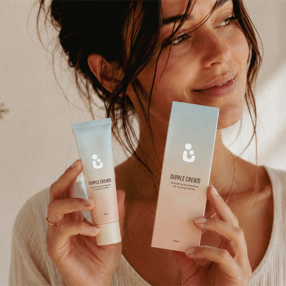
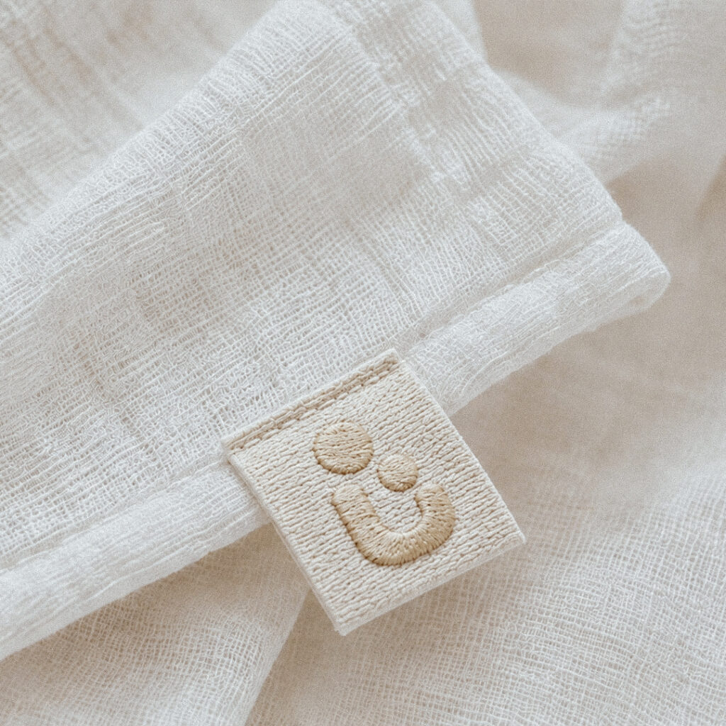
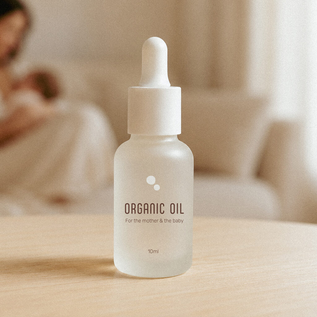
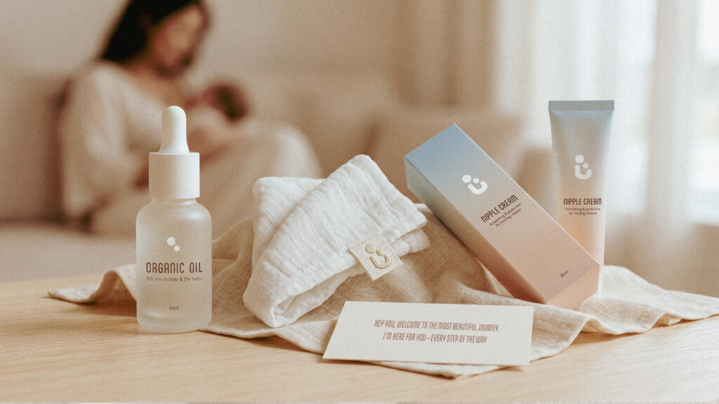
BRAND COLLATERAL
Collateral
A small welcome kit designed as a gift for every mother beginning her support journey with Maya.